How I Built the Atlas of Arda
Tolkien's geography is interesting. The way the world physically reshapes itself across the ages, the way continents drown, whole ages have no Sun, the flat world becomes a sphere. So at some point I went looking for a clean map of all of it, and found that the maps online are dense, scattered, and often disagree with each other. There isn't really a single "truth," which is itself part of what makes it interesting.
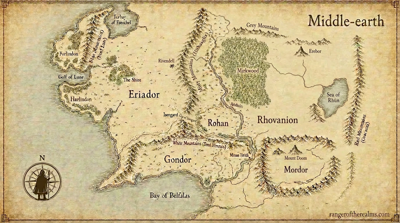
What I actually wanted was a simple, beautiful geographic illustration of the Tolkien universe. So I built one: An Atlas of Arda, a visual walk through Tolkien's world, age by age.
I liked the outcome a lot, and I figured some might find the process interesting too. I'm having fun with it. I went down a wrong path first, came back, and ended up with something much smaller and more elegant. Like most things I'm building these days, it's a story about what an AI model is good at, what it's bad at, and where the real human work hides.
You're doing it wrong
My first attempt was the obvious one. Build a little web app, draw the coastlines as SVG paths, drop labels on top, add a slider that toggles between ages. I had Claude help me hand-author every river and every border. It looked OK, briefly. Then I asked it to render the First Age, and what came back was a mess. Numenor came out as a vague potato. ("Numenor is supposed to be a five-pointed star," I remember writing, looking at the screen.) Beleriand was unrecognizable.
I paused the project and walked away from it for a few days. The thing wasn't getting better, and I could feel I was building it the wrong way.
Back to basics
When I came back, I tried a completely different framing. What if I stop trying to draw geography in code, and let the image model do it - but only once per region? The idea was simple enough to just be worth trying. Tolkien's geography is fixed. It doesn't change. The shape of Mordor is the shape of Mordor. Style, on the other hand, varies endlessly: parchment, watercolor, schoolbook, illuminated manuscript, whatever. Modern image models are not great at the first thing (they keep inventing geography) but they are excellent at the second.
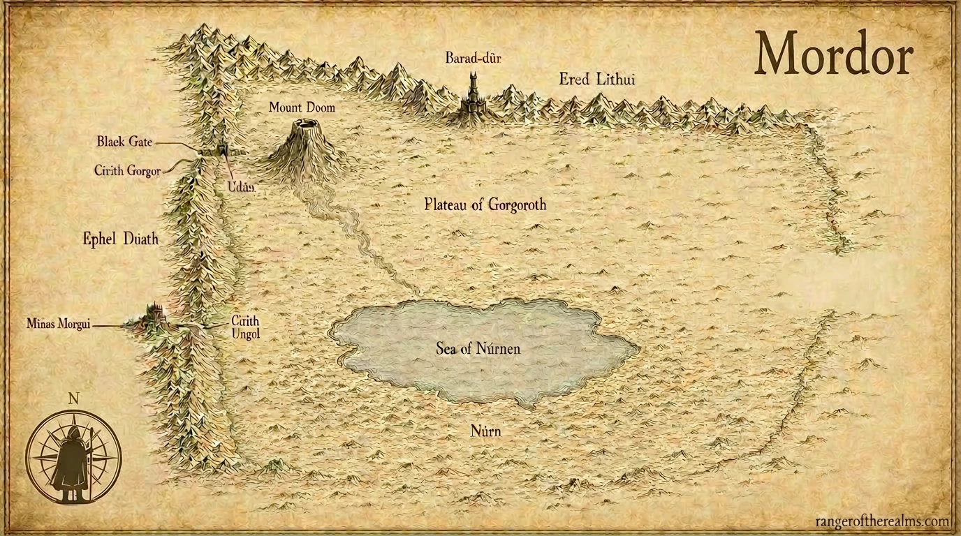
So: separate them. Generate one careful, plain black-and-white "schoolbook" reference per region, get the geography right, lock it in forever. Then for every styled render after that, hand the model the locked reference and say "make this look like Pauline Baynes painted it." The geography is preserved by the image; the style is supplied by the prompt. Geography fixed, style variable.
That collapsed the whole problem. I no longer needed to know how to draw Mordor. I just needed to be able to describe Mordor accurately enough, once, to coax a faithful reference out of an image model.
Teaching a model the shape of an imaginary world
The interesting part was getting that first reference to come out right. If you just ask an image model for "a map of Middle-earth," what you get back is dispiriting: a Mediterranean-shaped continent, half the labels in invented Latin, sometimes a little inn sign reading TERRA MEDIA. The model doesn't know Middle-earth. It only knows the average of every "fantasy map" it has ever seen.
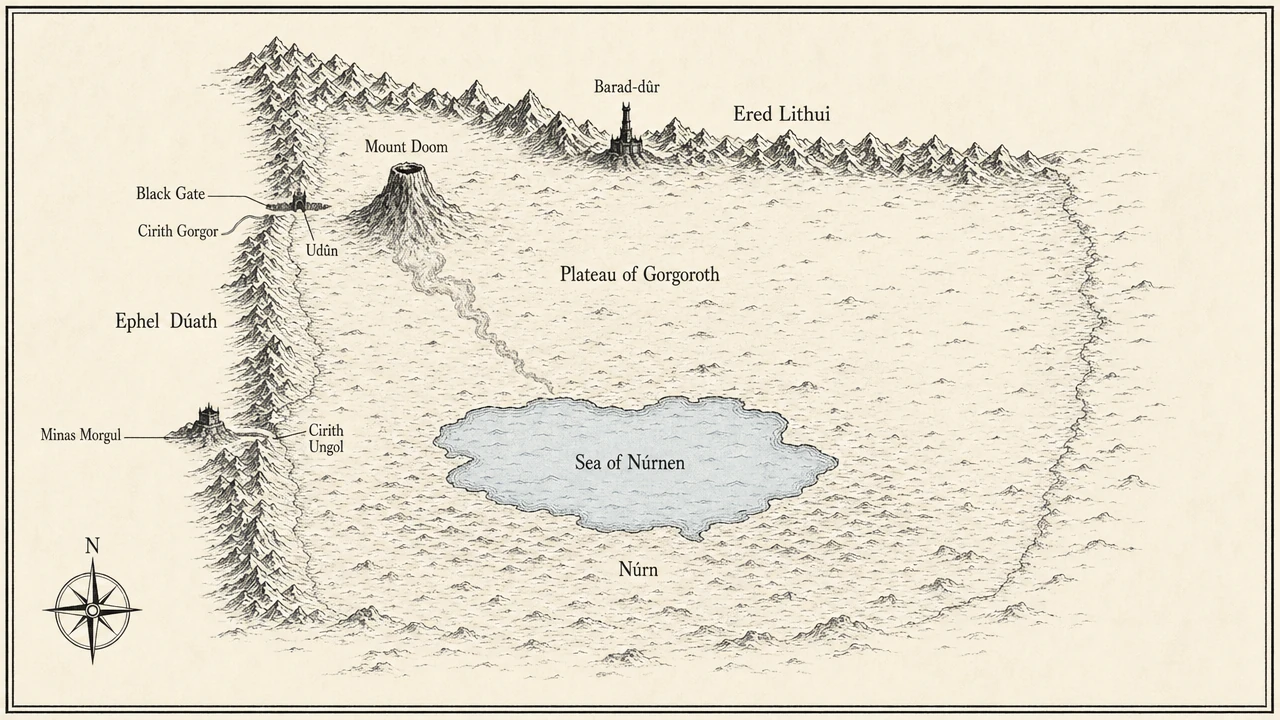
The fix was a thing I started calling a shape grammar - a frozen vocabulary that describes the silhouette of every region, written down once and pulled verbatim into every prompt. It reads almost like stage directions, and that turned out to be exactly the right register. I'm not asking the model to be creative; I'm telling it the shape of the thing. Here's the actual entry for Mordor, copy-pasted from the file:
The land of Mordor in the Third Age - a roughly rectangular plateau enclosed by three mountain walls forming a great open-cornered box. The Ered Lithui, the Ash Mountains, run east-west along the northern edge. The Ephel Duath, the Mountains of Shadow, run north-south along the western edge and continue east-west along the southern edge, forming an L. The northwest corner is open: this is where the Black Gate (Morannon) stands, the only formal entrance, set in a narrow gap. Inside the box, slightly north of center, stands Mount Doom (Orodruin), an isolated volcanic cone with a dark smoke plume.
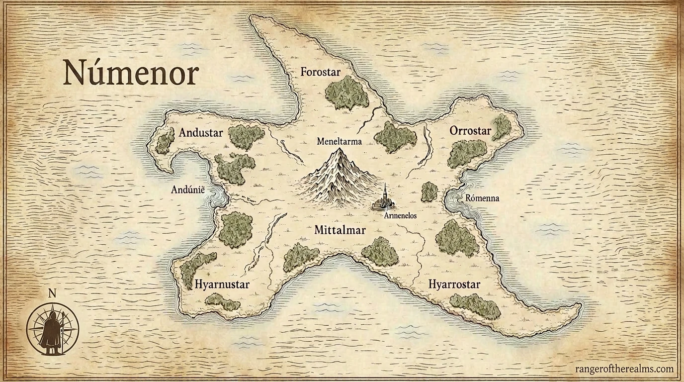
Numenor gets one line: "a five-pointed star island, symmetric, like a starfish or a pentagram, with five long capes radiating from a high central peak." Beleriand: "a roughly triangular subcontinent with three iron peaks (Thangorodrim) at its northern apex." Twelve regions, all written like that, all frozen.
Combined with a frozen "preamble" describing the era (the world is flat, the Sun has not yet risen, etc.) and a hard list of things not to draw (no Earth-shaped continents, no Latin captions, no inn signs, no Christian iconography, which the model strangely loves to default to), the prompts started producing references that actually looked like Arda.
Sometimes it isn't the prompt, it's the model
Even with all of that, one image kept failing. Numenor. The model would give me a six-pointed shape, or a sort of asymmetric blob, anything but a clean five-pointed star. I rewrote the prompt three different ways. I tried "pentagram." I tried "starfish." Nothing worked.
Eventually I gave up and tried a different image model entirely (I'd been using Gemini; I switched to OpenAI's image model through OpenRouter). Same prompt. First try: a clean five-pointed star. That was a useful lesson, and one I keep relearning. Prompt engineering only takes you so far. Sometimes the right model matters more than another paragraph of instructions.
Simplifying to the actual outcome
Once I had all the maps, I had to actually put them on the site. My first draft of the atlas page was a tidy reference grid: every age, every region, ordered, labeled, no nonsense. It was complete, but it was complicated and a little cold. To get to a guide that someone could actually walk through, I had to keep cutting.
The second pass was a guided walk through five ages, in plain language, with the maps as scaffolding for a story rather than the point of the page. The First Age isn't "Beleriand, bounded by the Iron Mountains, divided by the river Sirion." It's "the world that ended." That's not a smaller amount of information; it's the same information aimed at someone who picked up the books, watched the movies, watched the shows, and just wants the geography to make sense.
That simplification was the most important thing I did on the project, and it had nothing to do with prompts or models. It was just being honest about what I was actually trying to make.
What I take away
Two things, really. The first is the small technical idea, which feels generalizable: when you're using a generative model for something, look hard for the part that's actually fixed and the part that actually varies, and treat them differently. Encode the fixed thing once, somewhere durable. Let the model do the variable part. I spent a couple of evenings trying to get a model to redraw geography on every render, and a couple of hours generating five locked references that solved it forever.
The second is bigger and I keep running into it. Tools that are very good at making things will make you a lot of mediocre things very fast unless you have a clear answer to "who is this for?" The Pauline Baynes map of Middle-earth (linked here, with Tolkien's own annotations, and worth twenty minutes of anyone's life) is a quiet masterpiece partly because it knows exactly who it's for. Mine doesn't aspire to that, but it does aspire to be useful to one specific kind of reader, and once I held that in my head the rest of the work got a lot easier.
If you want to poke around, the atlas is here. If something's wrong with the maps, let me know. Hope you enjoy them.